









THE EDITING ROOM / COLOR
A good cut should not look like a sudden change of weather.
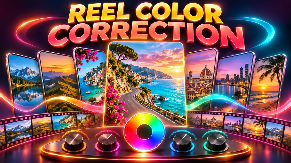
Reel color correction helps neighboring clips feel as though they belong in the same video. Start with brightness and white balance before reaching for a dramatic filter.
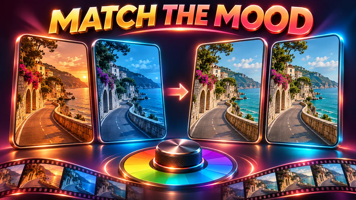
You trim two clips together and the timing feels right. Then you notice the problem: one scene looks warm and inviting, the next looks blue and dim. Adding the same filter to both may exaggerate the difference. A few small corrections usually make a more useful starting point.
This guide focuses on matching the look of short videos, not choosing export settings or building transitions. Control names vary between editors, but the questions to ask are similar. Keep your original files and work on a copy so you can compare changes.
1. Start reel color correction with a reference clip
Choose one shot that already looks close to your intended result. It should represent the scene fairly, with a visible subject and useful detail in the bright and dark areas. Compare the next clip against it rather than adjusting each clip in isolation.
“Consistent” does not mean identical. A sunset should not look like an overcast afternoon. Match distracting differences while keeping changes that belong to the story. If the location genuinely changes, a different light quality may help the viewer understand the move.
2. Balance brightness before chasing a look
Watch the subject as you move between clips. Does a face or main object suddenly become much darker? Adjust exposure or brightness gently, then check highlights and shadows. Brightening everything at once can wash out a sky while leaving the important part of the scene unclear.
If your editor offers a waveform or histogram, use it as an additional check rather than relying only on the display. Do not expect a slider to restore detail that was never recorded. When a clip is badly damaged, replacing it can be more effective than pushing every control further.
3. Check white balance without erasing the atmosphere
A neutral wall that turns green or blue between shots can distract from an otherwise smooth sequence. Temperature and tint controls help address these shifts. Use something that should be neutral as a reference, when the scene contains one, and keep checking the main subject.
A warm lamp or colored stage light may be intentional. Reel color correction should not automatically remove that mood. Move a control a little, compare the result with the original and stop when the unwanted cast is reduced without making the scene feel artificial.
4. Keep saturation and skin tones believable
Strong colors can make a frame attractive, but pushing saturation globally may make skin, food or familiar objects look strange. Check those recognizable details before judging the whole image. If only one color causes trouble, a smaller targeted change is preferable when your editor supports it.
Ready-made or AI-generated clips may already have a strong grade. There is no need to apply another dramatic preset simply because one is available. Correct a real mismatch first. Keep intentional fantasy colors when they serve the visual idea.
5. Compare clips at the actual cut
Play the last second of one shot and the first second of the next several times. A mismatch is often easier to spot in motion than in a frozen frame. Check the brightness of the subject, the background color and the overall contrast, then make one change at a time.
Now watch the sequence from the beginning. If color feels consistent but the edit still seems abrupt, the problem may be timing or movement. Our reel pacing guide covers those decisions separately. Do not try to solve every editing problem with color.
6. Review the exported file, not only the timeline
Export a short test and watch the actual file. Check it at a comfortable screen brightness and compare it with your intended look. A phone’s display mode and ambient light can affect your impression, so one screen is not a perfect reference.
If the export looks unexpectedly washed out or different from the timeline, check your editor’s color-management and export guidance for the source footage. Mixed HDR and SDR workflows need particular care. Avoid stacking more corrections onto the footage before understanding where the change happens. Use our reel export checks for the separate output review.
A practical finishing order: choose a reference, balance the clips, add a creative look only if needed, then watch the export. Reel color correction is about making deliberate decisions, not maximizing every slider.
Choosing footage for a consistent edit
When exploring WorkLinc’s Reels Bundle collection, watch samples for lighting, contrast and the visual style you want. The current AI Couple Reels Bundle, for example, describes cinematic and romantic AI visuals. Judge the samples rather than assuming every file will match your own footage. Confirm the listing and license before editing or using any asset.
Common questions about reel color correction
Is color correction the same as color grading?
Correction deals with unwanted differences and helps shots sit together. Grading is the creative look you choose after that. Adobe’s color correction and grading overview explains that distinction and the role of exposure, white balance and contrast.
Should I use the same preset on every clip?
Not automatically. Two clips may start with different exposure or white balance. Balance those differences first, then judge how a shared look behaves on each shot.
Can I fix every color problem after downloading a clip?
No. Heavy compression, missing highlight detail or a strongly baked-in look can limit what you can recover. Keep changes modest and choose a better-fitting source when necessary.
Will these checks guarantee better reach?
No. They help you assess visual consistency. Audience response depends on many things, and an editing checklist cannot guarantee distribution, views or earnings.